
A town’s municipal website usually has the reputation of being outdated, disorganized, and overwhelming. Think about how much information they have to put out for residents and businesses. Municipal websites serve an important role in providing critical information to their residents, business, and visitors. However, it always seems like the website reflects the internal workings of the town’s infrastructure rather than the public’s usability. This is where a well structured information architecture (IA) comes into play. Without it, poorly designed websites and applications lead to user frustrations ultimately leading them to never return to the site. In this post, we will be exploring the IA of the Plymouth, CT website and how to reorganize it to become and intuitive and efficient experience.
What is Information Architecture (IA)?
According to the Interaction Design Foundation, information architecture is defined as, “the discipline of making information findable and understandable”. Basically, it’s how we organize and label content so it is easily findable. Information architecture applies to both real world and digital experiences. We want to be able to find what we are looking for in a museum or grocery store just as much as when we are browsing the internet. When an IA is considered to be good, it will take into consideration three aspects; content, context, and user. Content is the information that you’re organizing, the user is who is interacting with your system, and context is how the user interacts with the content.

Why Does Information Architecture Matter?
When it comes to UX design, information architecture is the backbone of the digital experience. Without a good IA, your website or application will be left disorganized and your users won’t be able to find the information they’re looking for. Having an understanding of your users and what they’re looking to get out of your product is the beginning of good IA. After knowing how they behave and search for information, you can go on to create the right site map, user flows, and navigation for your product.
This is especially important for municipalities because there are so many different types of users coming to the site. Business owners have different needs than residents and so do potential visitors. Creating a clear information architecture that satisfies all three users will serve the public efficiently.
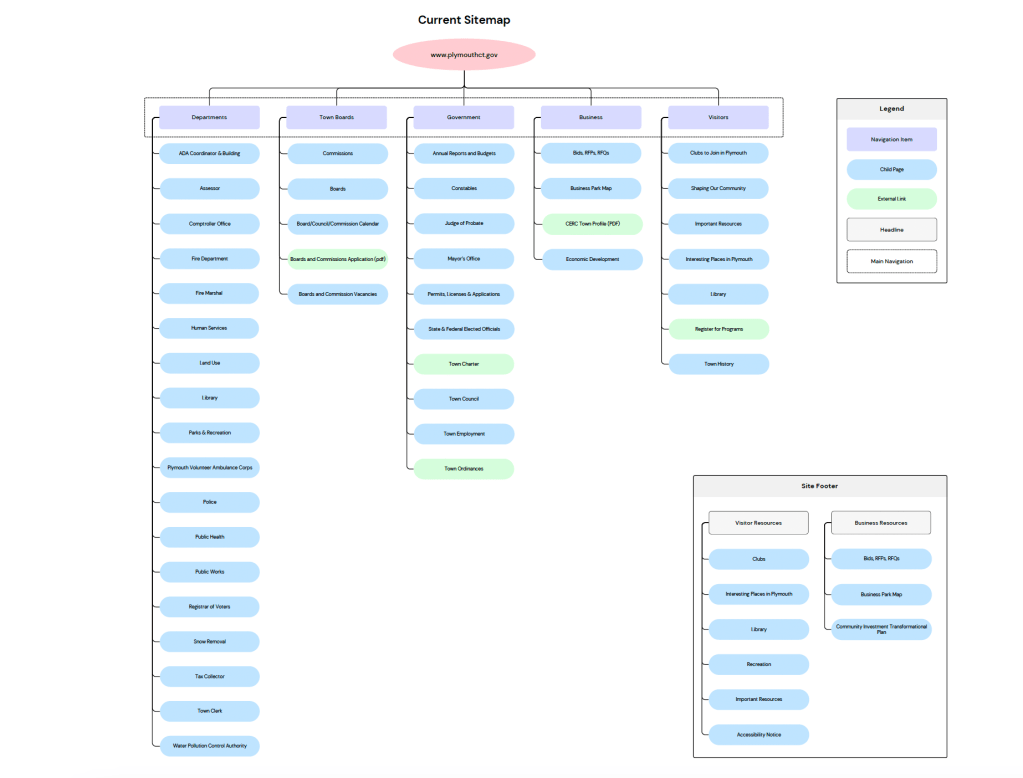
Plymouth, CT’s Current Site Map
The current site for Plymouth, while not incredibly large, has a well sized structure that is divided up into very broad categories such as Departments, Boards, Government, Business, and Visitors. This organization may satisfy one group of users, but it doesn’t necessarily satisfy all three. The following are observations I made that show me a lack of organized IA:
- Redundant and Vague Pages: Pages like “Important Resources” and “Interesting Places” don’t tell me much about what the page content will be and are located in multiple categories.
- Hidden Utilities: Actions like “Pay a Bill”, “Report a Problem”, and “Register to Vote” are listed on the homepage, but are not accessible through the site’s navigation. This makes it inconvenient for the user to have to navigate back to the homepage if they are within the site and want to complete one of these actions.
- Uneven Page Distribution: There are eighteen pages listed under the Departments navigation while the remaining four categories range from 4-10 child pages.
It’s clear that there is a lot of information on Plymouth’s website, but it forces users to dig and backtrack for some of its most critical information.
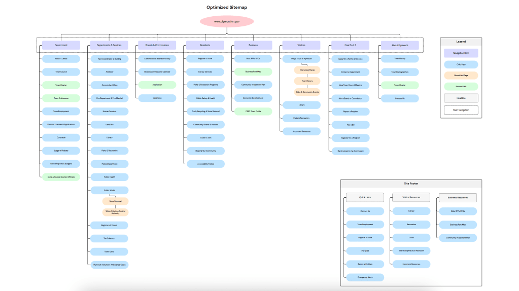
The Proposed Site Map
Usability was the most notable challenge about the current site map. Taking into consideration the three types of users on the Plymouth website, I developed a streamlined IA that focuses on user centered categories and clearer labeling. The new top level navigation includes:
- Government
- Departments & Services
- Boards & Commissions
- Residents
- Business
- Visitors
- How Do I…?
Each category is designed to guide the user based on who they are and the information they are likely looking for. Some of the most notable changes are:
- Consolidated Utility Links: All of the action based links and pages, such as “Pay a Bill” or “Report a Problem” are grouped under the “How Do I…?” category. Users looking to complete these actions are most likely thinking that question.
- Clearer Pathways: “Departments & Services” is now the place where all service-based departments live while “Boards & Commission” covers any civic engagement opportunities.
- Reduced Redundancy: Any duplicate links, such as Library, Parks & Recreation, and Clubs, are consolidated under clearer parent categories like “Residents” and “Visitors”.
- Business Friendly Structure: Business resources like “Bids, RFPs, RFQs” and “Economic Development” are grouped into one consolidated Business category, making the site more appealing to potential investors and developers.
In order to expand the availability of particular town knowledge, I have some new pages that I feel will have information that users are looking for. These new pages include:
Under Residents
- Library Services (distinct from Library department)
- Parks & Recreation Programs (task focused)
- Trash, Recycling, & Snow Removal (previously buried under departments)
- Community Events & Notices
- Shaping Our Community (previously under Visitors)
Under How Do I…?
- Apply for a Permit or License
- Contact a Department
- View Town Council Meeting
- Join a Board or Commission
- Report a Problem
- Pay a Bill
- Register for a Program
- Get Involved in the Community
Under About Plymouth
- Town History (relocated from Visitors)
- Town Demographics
- Contact Us
Why Does This Matter?
Redesigning a sitemap isn’t just about moving pages around to where you think they fit best, it’s about having empathy and good strategy. Good information architecture does many things such as; help users find what they need quickly, eliminate clutter and confusion, and build a structure that can grow and evolve. Small towns like Plymouth often have access to limited digital resources which makes their websites become cluttered over time. If the site is first created with a good information architecture and follows all best practices, the site can remain functional for everyone for years to come.


Leave a comment