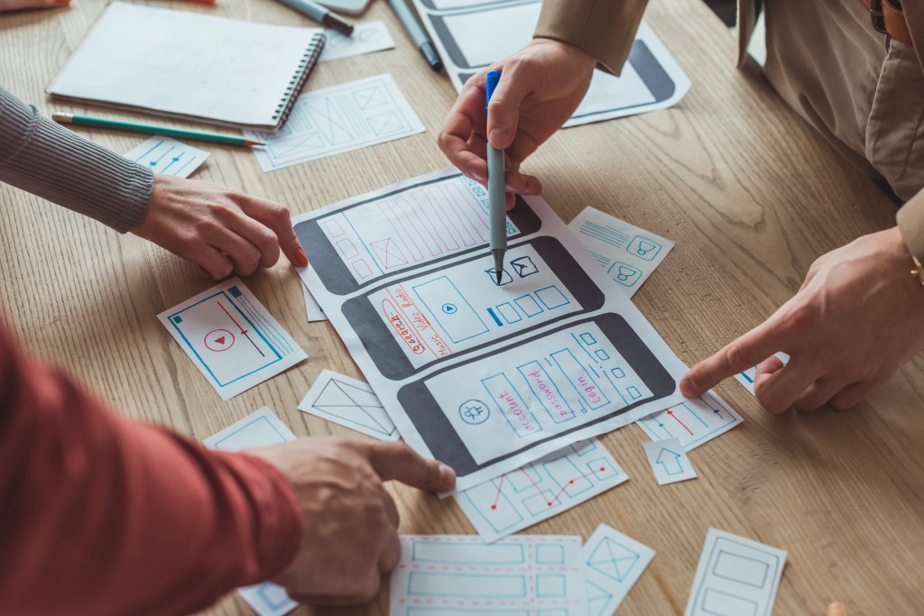
Before diving into high-fidelity designs and creating a polished interface, it’s important to stop for a moment and ask yourself, “Is this actually going to work with the users?”. That’s where usability testing with paper prototypes comes in. These simple designs on paper are more than just sketches. They’re a low tech way to catch design flaws early, gather good user feedback, and iterate rapidly without investing a lot of time in more polished mockups.
What Are Paper Prototypes and How Do You Conduct a Usability Test With Them?
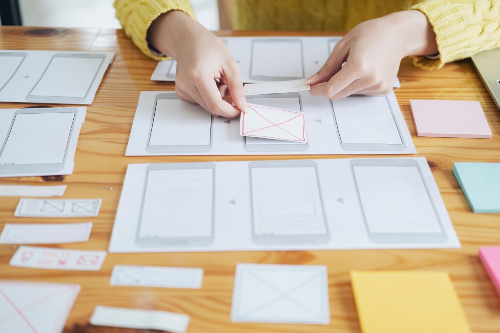
Paper prototypes are just like they sound – hand drawn screens to represent different interfaces and interactions with a digital product. They are a quick and flexible way to communicate design ideas and test user flows. When a paper prototype usability test is performed, participants are asked to complete tasks with the paper mockups while being observed by the designer or researcher. The data that is collected is usually how the user navigates within the prototype, what confuses them, and where improvements can be made. Usability tests with paper prototypes can be done in two ways; the participant interacts with a physical prototype and drawn screens are switched out by the researcher or a digital prototype is created by uploading sketches to a software (such as Marvel App) and interactions are connected through the app.
Why Does This Method Matter?
The method of conducting usability tests with paper prototypes is very helpful at the beginning of the design process when it’s easy to make changes. Not a lot has been set in stone for the design so it won’t disrupt the path is changes are needed. It also encourages the designer not to focus too much on the visuals of the product, but rather focus on the user journey and structure of the product.
MyPlymouth Paper Prototype Testing
I’ve conducted a paper prototype usability test for my app MyPlymouth. The app is a municipal companion app designed for the residents and business owners of Plymouth, CT. Using the POP (prototyping on paper) app, Marvel, I conducted two in person tests. The following are the findings from my research:
Participant 1
My first participant successfully completed all four usability tasks without any major issues, which was encouraging. However, they offered several thoughtful suggestions to improve the user experience. For Task 1, they recommended integrating location services so the app could automatically attach the user’s current location, and also suggested using image analysis to help autofill the description when uploading a photo. During Task 2, which involved registering for an event, they proposed adding an option to include information for additional participants. For Task 3, while turning on notifications was straightforward, they felt the button text could be more clearly worded to reflect its function. Finally, in Task 4, although they managed to check saved applications, they noted that this task felt a bit buried—suggesting the app should offer a more direct way to access saved applications without needing to begin a new permit process.
Participant 2
Participant 2 encountered a small challenge during Task 1 when trying to find where to submit a problem for a pothole. Once they found the right tab, however, they felt the flow was clear and easy to follow. In Task 2, they completed the registration process with no issues and particularly appreciated the ability to add the event to their calendar. They suggested offering options for different calendar platforms like Apple, Google, or Outlook to better accommodate user preferences. Task 3 was completed with ease, and they liked that they could preview more details about the notification before enabling it. During Task 4, the participant successfully navigated to their saved applications but mentioned that the wording on the button could be clearer, as it caused a moment of hesitation.
Final Thoughts
Overall, conducting usability testing with paper prototypes proved to be an incredibly valuable step in the design process. Even with just two participants, I was able to identify areas of confusion, validate what was working well, and gather a range of thoughtful suggestions that I hadn’t previously considered. From clarifying button labels to enhancing feature functionality, the feedback I received will directly inform my next iteration of the MyPlymouth app. This process reinforced the importance of testing early; even simple sketches can spark meaningful insights that lead to a better, more user centered product.


Leave a comment