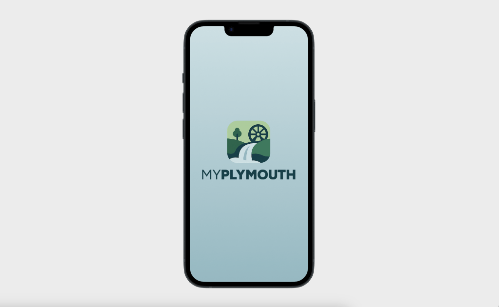
I developed a mobile app prototype called MyPlymouth that is meant to connect residents and business owners of Plymouth, CT with their local government. This project took me through the steps of the design process from user scenarios to high-fidelity prototypes. This app is a real world simulation of how user experience designers create meaningful products to help people navigate their communities with ease.
About the App
MyPlymouth is designed to serve as bridge between the residents and business owners of Plymouth and their local government resources. Whether a user is reporting an issue, registering for an event, or applying for a license, this app provides a streamlined experience for accessing town services. The goal of the app is to be a companion to the Plymouth, CT website. It’s also meant to be a centralized and easily accessible hub for all that goes on in Plymouth. Some of the key features include:
- Real Time Alerts: Users are kept up to date with emergency notifications and weather related delays.
- Civic Access: Submit issues, pay bills, and apply for permits.
- Event Management: Users can browse and register for town programs and events.
- Resource Directory: Users can access school schedules, official contacts, and other department information.
- Business Tools: Find bids and RFPs and manage licenses and permits with ease.
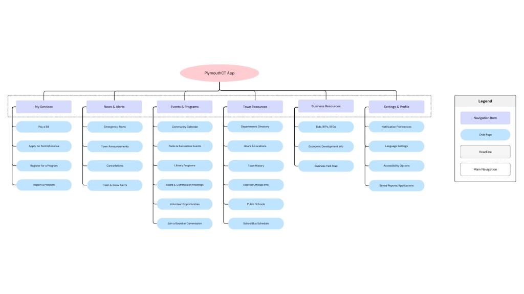
Information Architecture
Before beginning the design, I spent time looking at the current Plymouth town website and mapped out a cleaner, more user focused information architecture. I developed a new sitemap for both the website and the app to show how the content can be better organized. After that, I created user personas and scenarios based on real Plymouth residents:
- Jane: A busy parent who wants to register her kids for weekend events.
- Lena: A business owner looking to manage licenses and discover local contracts.
- Carlos: A newcomer eager to get involved in town boards and volunteer opportunities.
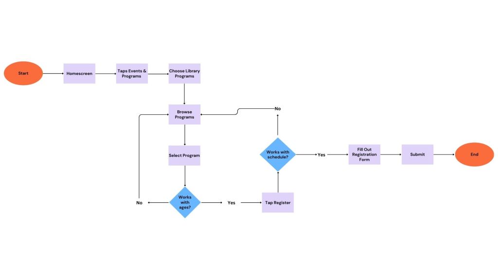
Each persona shaped user flows that showed how a typical user would navigate the app and achieve their goals. These flows then served as the blueprint for my prototypes.
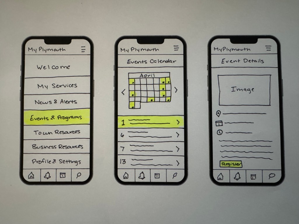
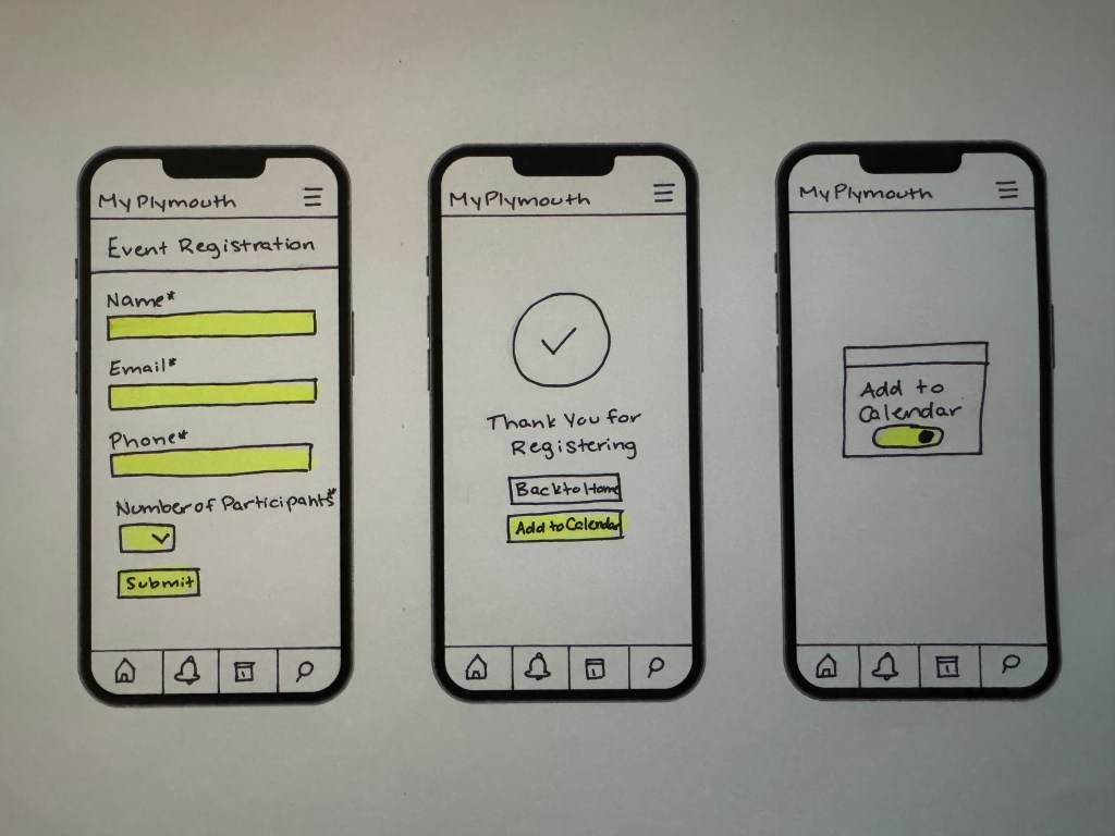
Low-Fidelity Prototyping
My initial designs were sketched using low-fidelity paper prototyping methods. I created interactive mockups in the Marvel App to simulate four essential tasks:
- Reporting a neighborhood issue (like a pothole).
- Registering for a town event.
- Checking snow and trash alerts.
- Applying for a license or permit.
Working on paper forced me to focus on the user logic rather than visual design and that turned out to be essential for testing my ideas early.
Usability Testing
I conducted in-person usability testing with two participants using my Marvel App paper prototypes. Each user was given task scenarios based on the flows I’d mapped earlier. I recorded their sessions and gathered insights about how intuitive the app was—and where it needed improvement. My key takeaways included:
- The users found the tasks to be relatively easy to complete.
- One easy requested that location services to be enables to make issue reporting easier.
- Both users liked the ability to add events to their calendar but asked for options for different calendar integrations.
- The wording on certain buttons caused some confusion.
High Fidelity Prototypes in Figma
I used Figma to build the final interactive prototype as it’s a platform I use regularly in my career, but have not explored it’s prototyping features. Some of the improvements I made from my paper prototypes to my final prototype are:
- Added a login screen to personalize user experience.
- Clarified confusing labels and simplified interactions.
- Updated alert settings to provide clearer options and functionality.
- Maintained a clean, minimal interface to accommodate a wide user demographic.
Reflection
Even with my background in website design, this project challenged me to think on the same level as a UX designer. Municipal services are much more complex because of their broad audiences. Being able to understand the needs of different users was an eye opening experience. Each phase built upon the last, meaning that without taking the time to consider information architecture, user flows, or usability, I would have been designing in the dark. Going by each step meant that I was building a very clear structure.
This project made me feel more confident with my UX skills and taught me how to design for functionality and user satisfaction.


Leave a comment