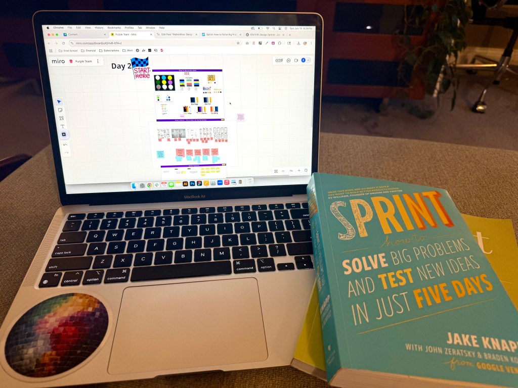
This week my team and I completed Phase 2 of our design sprint. Phase 2 is all about making decisions and finalizing a storyboard. Decision making during a design sprint can feel a little unnatural because there’s very little time to debate your choices. In Jake Knapp‘s book, Sprint: How to Solve Big Problems and Test New Ideas in Just Five Days, he says, “It’s all about getting the most out of the team’s expertise”. These decisions proved to be a big leap forward in my team’s app, WalletWize. WalletWize is a financial wellness tool aimed at Gen Z users. We packed our meeting with an agenda filled with making decisions and critiquing ideas. At the end of our time together, we narrowed down on our initial concepts and made good headway towards prototyping.
Setting the Tone: Brand Decisions
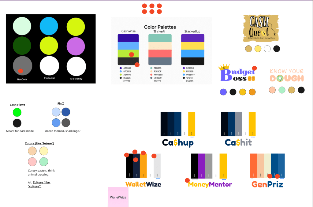
We started the meeting off strong by making an important decision – finalizing the name and color palette. We all came prepared to the meeting with a few ideas for a name and color palette. Using the dot voting method, we settled on the name WalletWise, but decided to add a twist and change the S to a Z to help represent the generation we are trying to target. The coinciding color palette includes a pop of orange alongside complimentary blues and grays. We also decided to lighten the primary blue color to make the interface more welcoming and modern. Feeling good about our first decision, we moved on to the Art Museum exercise.
Heat Mapping the Highlights
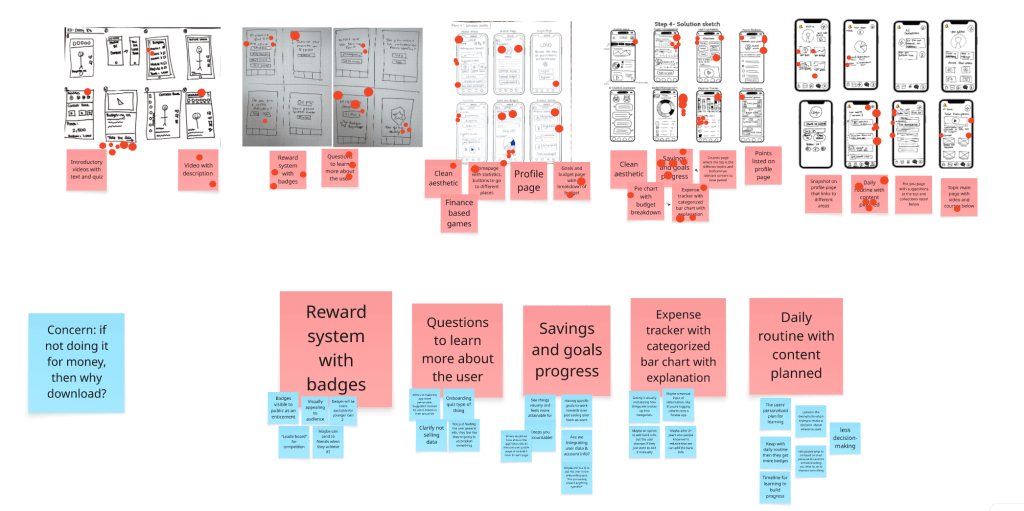
The Art Museum exercise is a fun way to review everyone’s solution sketches from the previous day or meeting. My team and I took about ten minutes to fully review everyone’s sketches to understand how our minds were working. After the timer went off, we proceeded to use heat map voting to decide on what sketches would make it to the next stage. By using unlimited red dots to mark what sketches we liked the most, we were able to see the concentration on the features we all agreed were best. This exercise showed us which features drew the most attention and excitement.
Speed Critique: Balancing Innovation with Usability
Next came the Speed Critique round. We reviewed the sketch concepts that had votes and one person called out what they thought was going on in the sketch. Another person noted this on sticky notes under each concept. After completing this exercise, we were able to narrow down the sketches to five features we thought would be the most important to include:
- Badge Reward System: We knew that badges and stickers motivate the younger Gen Z crowd. We discussed how to make the visible, shareable, and what their long term meaning would be. However, we did question how this would motivate the older Gen Z audience without a monetary reward.
- Onboarding Quiz: This was a favorite among everyone for its ability to help personalize the app. We also agreed that it has to be known that the users data won’t be sold to protect their privacy.
- Savings Goals & Progress Tracker: We thought that this made setting goals look more achievable. We also thought about a future where bank data can be integrated for more seamless accountability.
- Expense Tracker with Bar Charts: We liked that this clearly showed how money was being spent. For now, we decided it would be a manual input like many calorie counting and fitness tracking apps.
- Daily Learning Routine with Curated Content: Linking well with our badge reward system, this feature helps to structure the user’s journey. It helps to guide them through their learning without being overwhelming.
Finding a Flow that Works
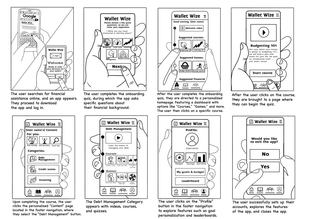
We then examined the proposed user flows. After a quick review and another round of dot voting, our decider chose the final path that factored in both tram feedback as well as her insights from recent user interviews. From her research we learned that users search for financial terms on Google which would be an opportunity for WalletWize to become their first source instead. After our flow was voted on, we moved into the storyboarding phase. We expanded our 6-step user flow into an 8 frame complete storyboard. Using sticky notes and our early sketches, we mapped each screen’s interaction including; a footer navigation with icons for Home, Profile, Courses, and Community as well as, a profile screen that features savings goals, badges, and an expense tracker. Two team members volunteered to finalize the storyboard with more complete sketches. We ended by discussing user perspective and potential interactive elements.
Wrapping Up with Confidence
We concludes the meeting feeling particularly clear and had good momentum. With good preparation and collaboration, we were able to take our rough ideas and turn them into a clear product direction. The next step to is begin prototyping and that is where we will see WalletWize really come to life.


Leave a comment