This week, my team and I entered phase 3 of our design sprint. Our mission was to transform our storyboard from Phase 2 into an interactive prototype that’s ready for user testing. With multiple meetings and plenty of team collaboration, we created a medium-fidelity, clickable prototype for WalletWize.
Step 1: Picking the Tools and Planning the Build
We started by picking our prototyping platform and we decided on Figma. Both myself and another team member have experience and feel comfortable working in Figma. It’s my favorite prototyping software because of how easy it is for multiple people to collaborate on one file. We also decided on building a clickable prototype over a functional prototype to save us time while still simulating the user journey.
Step 2: Using Our Storyboard for a Site Map
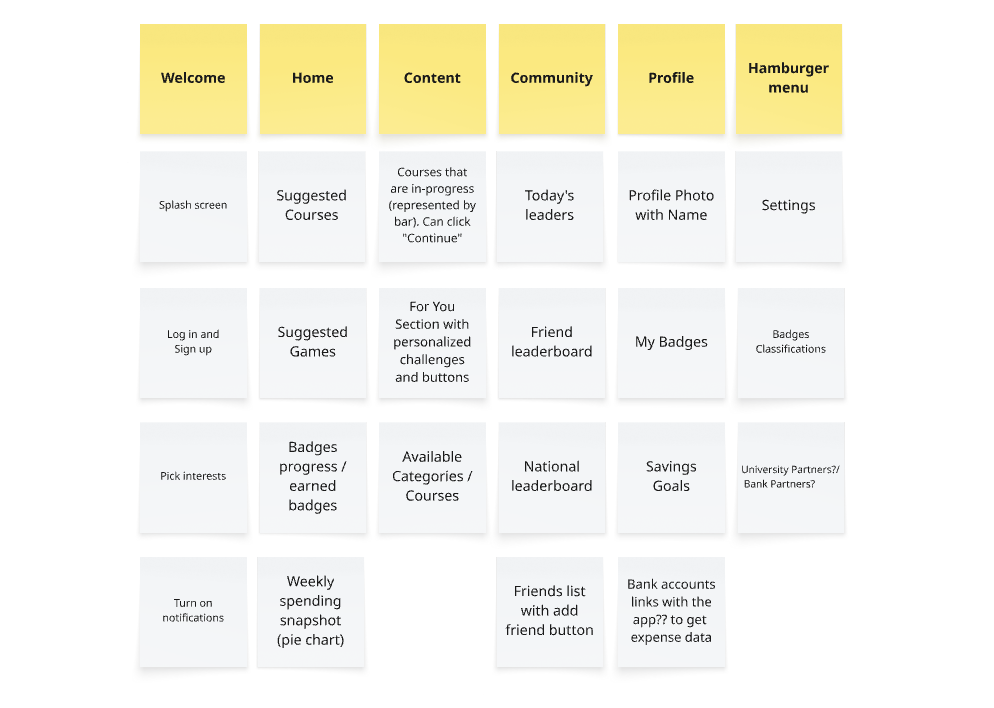
In Miro, we created a product breakdown that mirrored our storyboard. We outlines the app’s main pages: Welcome, Home, Content, Community, and Profile. We also planned the 20-25 screen prototype which included features like a friend and global leaderboard as well as banking integrations. Some more specific design choices included:
- Typography: Open Sans Semibold for headers and Open Sans Regular for body text.
- Color Scheme: A mix of orange and blue with clean black outlines.
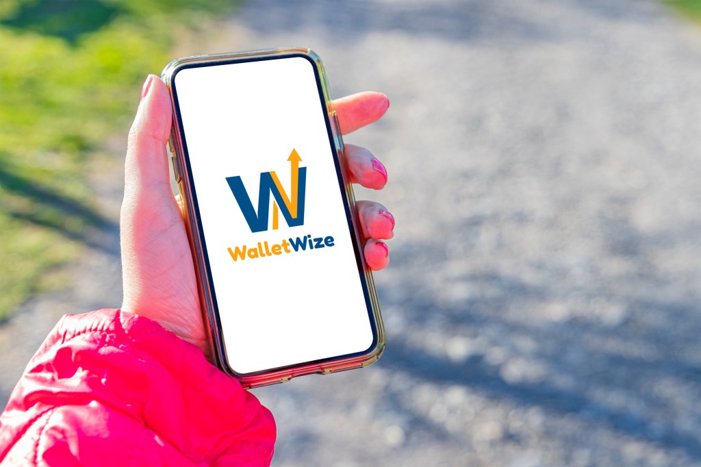
- Logo Design: The logo consists of a blue W with an arrow behind it to represent the increase in money you’ll get from using the app.
Step 3: Building the Prototype
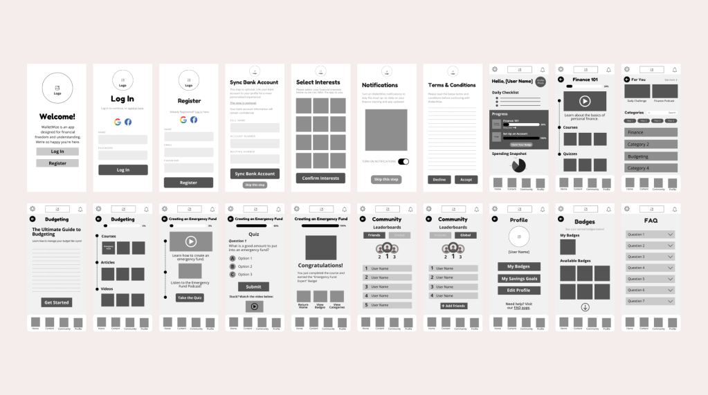
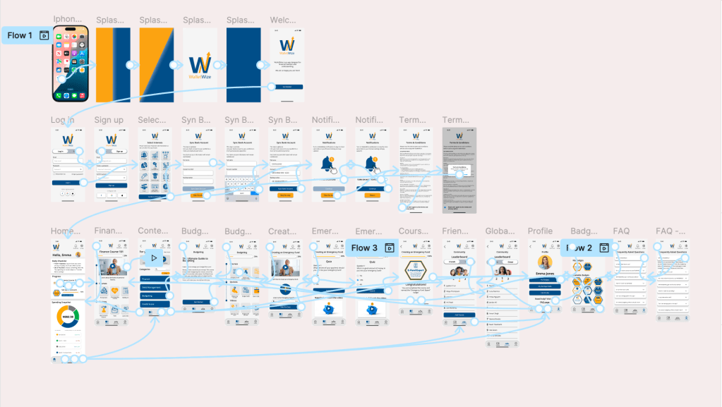
Before getting into Figma, our team planned on creating wireframes to guide the developers. Wireframes are critical in this process because without them, the developer doesn’t know what should be on each screen or how to keep it consistent. Think of it like a roadmap to get from one destination to the next. Without a map, you don’t know what turn to take next. We wireframed each screen so everything was clear. Some of our wireframes included; content interest selection page, banking integration page, home dashboard with progress bar, recommendations, and daily spend tracking, and the community page with leaderboards. The developers took these black and white wireframes and brought them to life. We then carefully stitched everything together and made sure the UI flow simulated one of a real user.
Step 4: Trial Run and Final Adjustments
We met one more time during the week for a trial run after the prototype was finished. We walked through each screen, showing everyone answering any questions that there might me. Not everyone worked on developing the prototype, so for a few people it was their first time seeing everything work together. Everyone on the team felt that the app is very clear and has an intuitive navigation. We discussed a few small tweaks to be made including; adding more badge icons to make that screen look fuller and finalizing some icon designs. Some last minute pieces of content were added and we wrapped up our prototype to get ready for user testing.
Our Vision Comes to Life
Phase 3 was where we saw WalletWize come to life. Our team built not just a prototype, but a product that feels real and ready for feedback. I’m very please with how my team’s prototype turned out despite the limited time that we had. I thought our product was very clear and I’m definitely looking forward to the user testing phase to see if real users agree.


Leave a comment