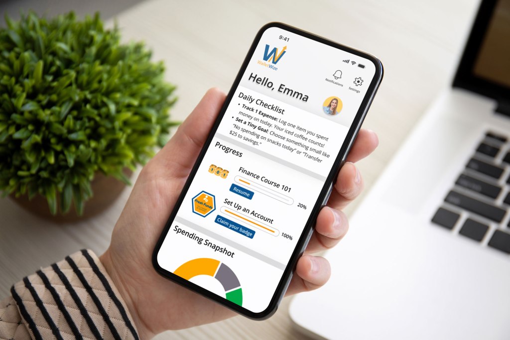
In phase 4 of our design sprint, we transitioned from building our prototype to testing it. After carefully building our app, WalletWize, it was finally time to put it in the hands of potential users. We wanted to watch them interact with the app and listen to their thoughts on what was and wasn’t working. User testing is vital to the success of your prototype because it shows you the pros and cons of your product before you invest a significant amount of money and resources into it.
Setting the Stage: Planning and Prep
We started by outlining our user testing plan. Based on what we read in Jake Knapp‘s book, Sprint: How to Solve Big Problems and Test New Ideas in Just Five Days, we developed a script that was very clear and consistent. This is how we structured it:
- Greet testers and explain the purpose of the test: “We’re not testing you, we’re testing the app”.
- Encourage the tester to speak openly while using the prototype so we know exactly what they’re thinking and feeling.
- Ask open ended questions during and after the tasks to get emotional responses.
We scheduled a single Zoom meeting for our testing session with the tests being ten minutes each and a five minute buffer in between. That allowed us enough time in case one test ran over or we needed time to debrief.
That Tasks and Prompts
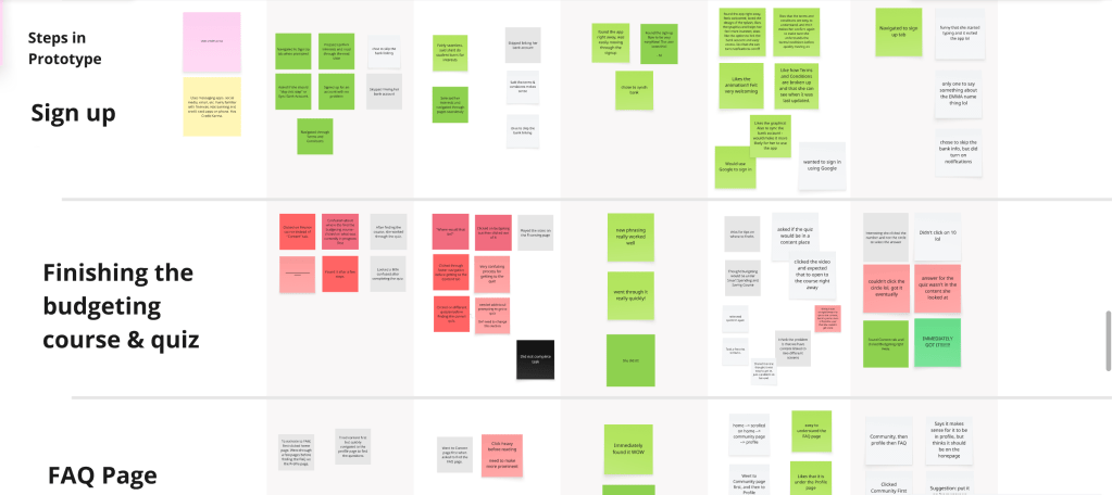
We asked each tester to complete four tasks in our Figma prototype. Those tasks were:
- Sign up for a new WalletWize account
- Navigate to the Budgeting topic and finish the Emergency Fung quiz
- Locate the FAQ page
- Find the Friend Leaderboard
After each task, we asked the testers questions like, “How was that process for you?” and “What are you thinking right now?” in order to get a full scope of their thoughts and emotions during the process. At the end of the test, we asked them to reflect on their overall experience, if there was anything they would change about the app, and if there was anything they would like to see added.
What Worked and What Didn’t
We took notes during the tests as well as sent out a post test survey. From both we were able to gather the following insights:
What Worked Well:
- The sign-up flow was easy and intuitive
- The friend leaderboard was easy to find through the Community tab
- Testers were impressed by the visual tracking on the homepage
- They liked the overall branding and design
- Testers liked that they were asked if they wanted to sync their bank account
- The structure of the interview make testers feel comfortable to talk openly
Areas for Improvement:
- The location of the Budgeting topic and the quiz confused several testers
- Some testers thought that the FAQ section was hard to find
Data at a Glance
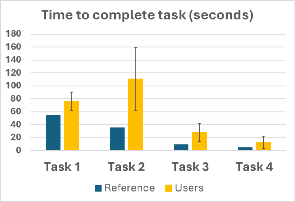
We tracked key usability metrics, summarized below:
Task Completion Time:
- Task 2 and 3 took significantly longer than the benchmark
- Task 2 showed a high variation leading us to believe there are usability issues in that flow
Task Success Rate:
- Task 1 (Sign Up): 100%
- Task 2 (Budgeting Course): 60%
- Task 3 (FAQ): 40%
- Task 4 (Friend Leaderboard): 80%
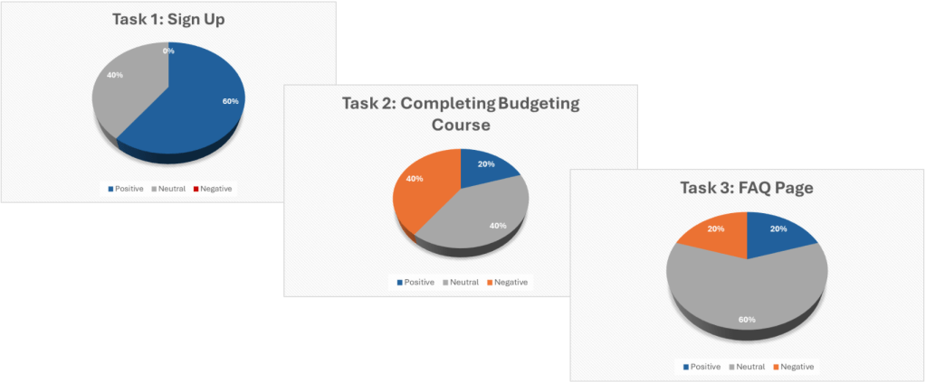
User Sentiment:
- Task 1: 60% positive
- Task 2: 20% positive, 40% neutral, 40% negative
- Task 3: Mostly neutral
- Task 4: 80% positive
Lessons from User Testing
We weren’t testing our prototype for validation, but rather for discovery. Our testers loved a lot of aspects of WalletWize, but seeing the confusion around the Budgeting topic and the FAQ gave us our areas for improvement. It was nice to see both the strengths and the pain points played out. This phase reminded up that good design comes from real world tests and improvements made with empathy.


Leave a comment