We live in a world where many young people feel like that managing their money is overwhelming. Often, they ask themselves questions like, “How much money should I be saving?” “When should I start planning for retirement?” “What’s an index fund?” and it seems like everyone they ask has their own opinions about what’s best. When tasked with building a financial literacy app for Gen Z, my team and I asked, “How can we make learning about personal finance engaging and intuitive for Gez Z?”
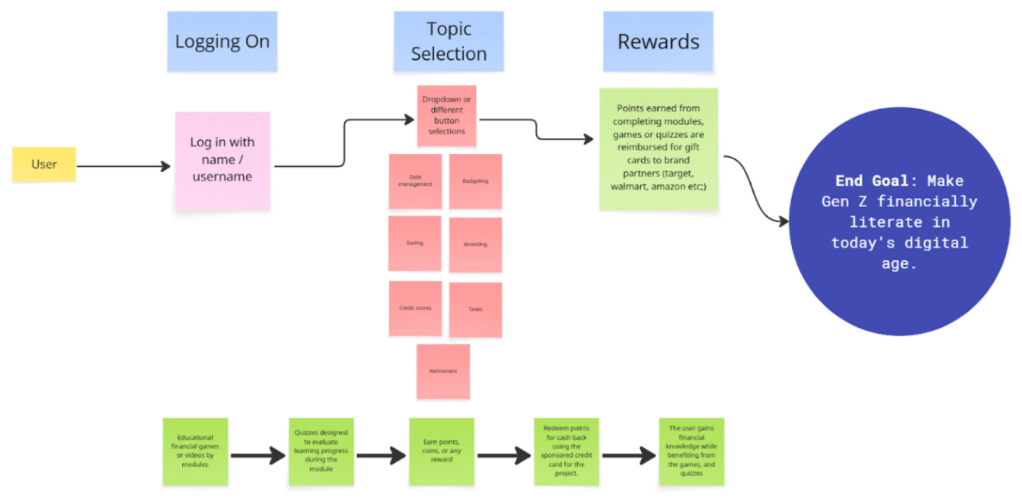
Our goal was to design an app that makes financial literacy approachable, enjoyable, and effective. With this in mind, we created WalletWize, a learning platform fit for the behaviors of Gen Z users.
The Process
We followed Google Venture’s Design Spring model with the help of Jake Knapp‘s book, Sprint: How to Solve Big Problems and Test New Ideas in Just Five Days and Pattie Belle Hasting‘s book, The Sprint Handbook. We adapted the five day process over five weeks to deeply explore the design sprint model.
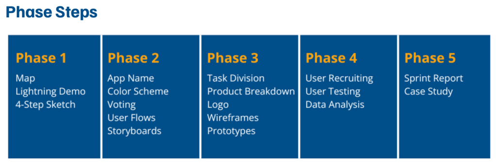
Week 1: Understand & Define
We started our sprint by defining our user personas, journey mapping, and generating “How Might We” (HMW) questions. After voting as a group, we focused on four core HMWs:
- How might we engage Gen Z the best so they don’t want to use a different app?
- How might we make learning about money as addicting as social media?
- How might we make complex financial topics easy and engaging for Gen Z?
- How might we keep users coming back to build consistent financial habits?
These helped us to build a user map and identify key touch points. We also conducted Lightning Demos of top educational apps for inspiration.
Week 2: Sketch & Decide
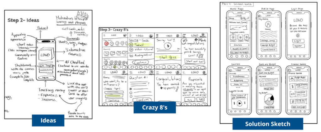
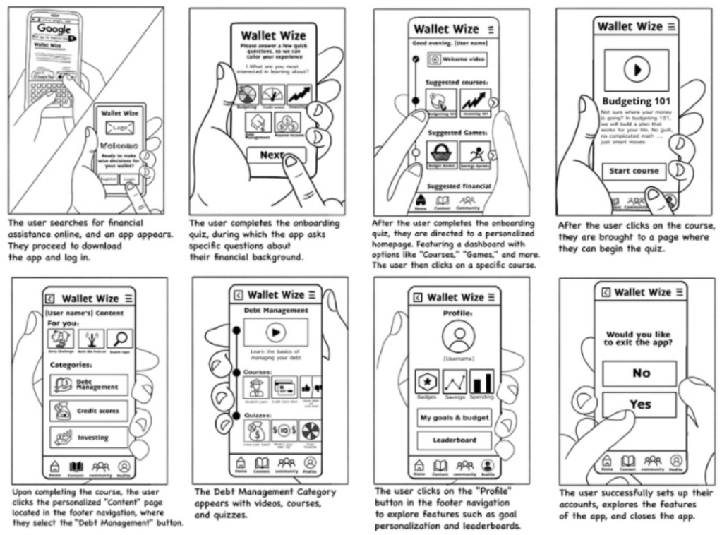
Using the 4-step sketch and Crazy 8s techniques, we explored potential layouts and interactions. We took several rounds of voting and selected a cohesive user flow which was then turned into an 8-step user journey that would be followed in our prototype.
Weeks 3-4: Prototype & Refine
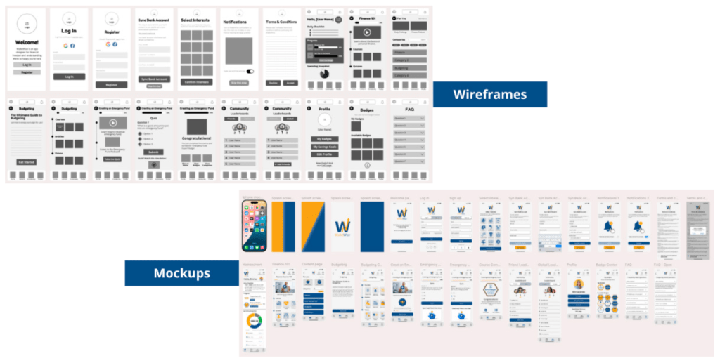
Based on our storyboard, we created wireframes in Canva and developed a medium-fidelity prototype in Figma. Each of us was assigned a role based on the GV “Maker” framework. Roles included; asset collection, writing, developer, and sketcher. The final prototype was interactive and ready for user testing.
Week 5: Test & Collect
We recruited five Gen Z participants and conducted usability tests via Zoom. Each team member interviewed one participant while the rest took notes. The users were prompted with four tasks:
- Sign up for a new WalletWize account
- Navigate to the budgeting topic and finish the emergency fund quiz
- Find the FAQ page
- Find the friend leaderboard
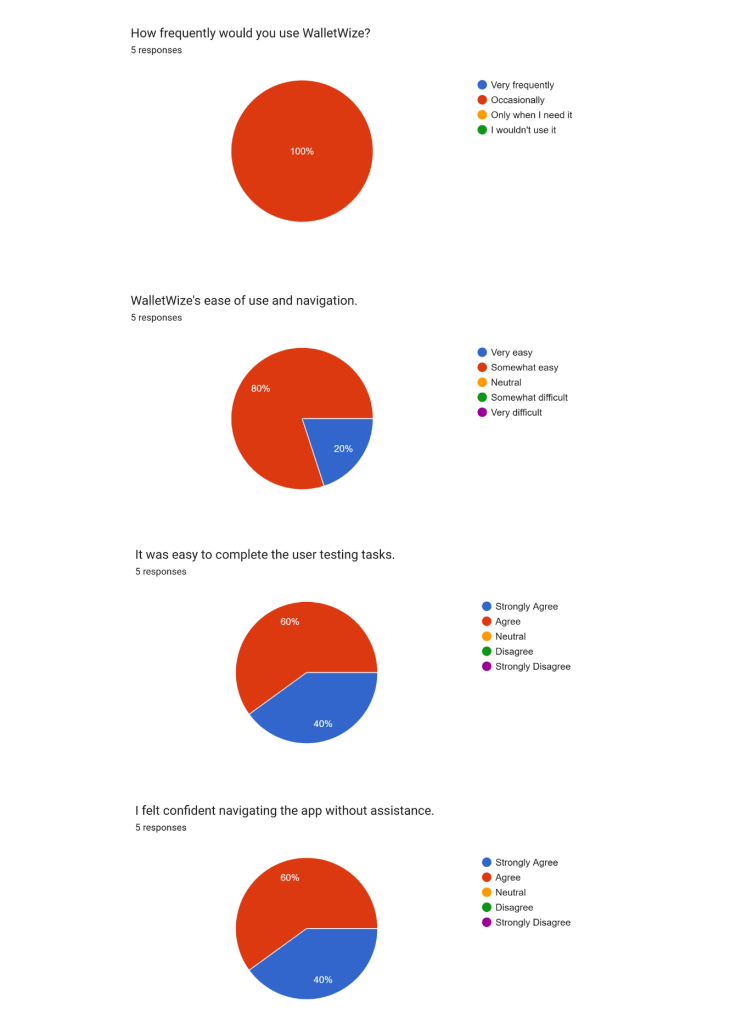
Feedback was documented in real time with Miro and the participants filled out pre and post test surveys through Google Forms. We tracked both qualitative insights and KPIs like how long it took to complete the task and task success rate.
Key Insights
We found that while the participants overall liked the WalletWize flow, there was still some tweaks to be made.
- What worked: Users loved the main interface, colors, and easy-to-use navigation. All felt that the app was easy to use and would help other young people learn financial basics.
- What didn’t work: Users struggled to find specific modules like the budgeting topic and coinciding quizzes. It seemed that navigation paths needed to be clearer.
Outcome and Reflection
The final WalletWize prototype showed clear usability and promise especially when it came to giving Gen Z financial content they could understand. From account sign up to course complete, we were able to validate what worked and what didn’t in the core interactions.
The sprint taught us that through structured ideation and collaboration, it’s possible to design a working prototype in a short period of time. We all have different backgrounds, but as a team we unified around a common goal and delivered a product that addresses a real world challenge.


Leave a comment