Data visualization is more than just creating attractive visuals. It’s about making sense of complex information that might otherwise be hard to understand. For many people, looking at a chart or graph is much more digestible than looking at raw data. It can save you time when performing research or reading results. Throughout time, technological advancements have changed what makes a chart not just good, but truly great.
The Pros and Cons of Technological Advances in Data Visualization
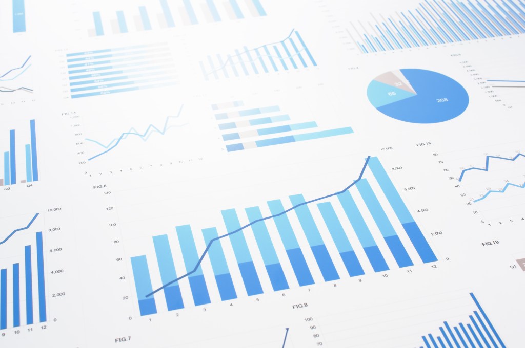
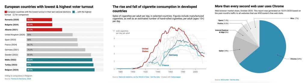
Within the past few decades, technology has changed how we visualize data. We no longer have to painstakingly draw charts and graphs. Instead, with a few clicks of a button, we can have immersive dashboards full with 3D maps, detailed charts, and immersive graphs. While this technology has increased the amount of possibilities of what can be done, there are some trade offs to be had. Here are some of the benefits and drawbacks of modern visualization technology:
Pros:
- Accessibility and Speed: Tools like DataWrapper and Tableau allow anyone to make easy to read visuals fast.
- Interactivity: Modern dashboards offer filtering options to make looking at the data easier.
- Scalability: Platforms like HEAVY.AI enable large datasets to be visualized without being slow.
- Creative Freedom: Many of today’s tools support animations, 3D graphics, and responsive designs.
Cons:
- Overcomplexity: Many of these new programs come with a lot of tools and when overused, they can cause clutter and confusion.
- Risk of Misinformation: If the creator isn’t properly trained, bad visualizations can distort or mislead viewers.
- Limited Accessibility: Not everyone has access to high speed internet or the newest devices, making complex data hard to view.
- Privacy Issues: Visualizing personal or sensitive data can unintentionally breach privacy regulations.
What Makes a “Good Chart”?
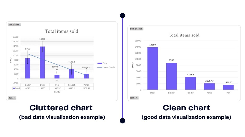
A good chart isn’t just about looking good. What actually makes a chart good is its ability to deliver clear and credible information. We live in a world now where everyone’s attention span is so short and there’s so much data online. A good chart will stand out if it can show the viewer insights without causing distractions. When visualizing data, it’s important to consider the following:
- Clarity: Information needs to be immediately understandable. This means using clear labels and legends, consistent color schemes, and clean typography.
- Appropriate Visual Form: Ensure that your chart type matches the data you have. For example; bar charts are used for category comparisons and line graphs are used to show trends over time. William Playfair‘s early charts were effective because they made abstract numbers and trends easy to interpret.
- Efficient Communication: A chart should deliver its message in under 10 seconds. Avoid too many labels, unnecessary effects, or any decorative clutter.
- Contextual Information: Never present your chart without titles and subtitles, axis labels, units of measurement, and data source attribution. This ensures that the viewer can interpret the chart correctly.
- Audience Awareness: Tailor the chart to what your viewers know and and expect. For example, a financial analyst and a middle schooler require different approaches even if they are looking at the same information.
- Emotional and Visual Impact: Clarity always comes first, but a strong visual can evoke emotion from the viewer. Enticing colors, spacing, and flows contribute to how the chart engages the viewer just as much as it informs.
What I Respond to Most in a Chart
I like charts that balance emotional impact and analytical clarity. When that balance is paired just right, I feel like the information displayed in the chart has the most impact it can have. A good example of this is John Snow’s 1854 Cholera Map. It plotted deaths by location to pinpoint the source of the outbreak. While it’s a simple, black and white map, it’s very clear to see where the disease is most concentrated. I feel like the lack of other details allows the stark concentration in the center to be the focus point.

Final Thoughts
Technological advances have put many powerful tools in our hands, but with all that power comes the many responsibilities. It’s important that data is thoughtfully and honestly designed to prioritize the viewer’s understanding. Not only can poorly designed data look bad, but it can cause misinformation and confusion. In our lightning fast world, data is everyone and to make the most impact, a lot of thought and care has to go into how that data is displayed.


Leave a comment