
Data visualization is more than making data easy to read and look appealing. It’s about choosing the right format to communicate your insights effectively. We will explore the four types of visuals defined by author Scott Berinato in his book Good Charts and also discuss the insights from David McCandless‘ TED Talk, “The Beauty of Data Visualization”.
Understanding the Four Quadrants of Data Visualization
Berinato categorizes information visuals into two different categories: Conceptual vs. data-driven (Visualizations based on abstract ideas or concrete data) or Declarative vs. exploratory (Presenting a specific conclusion or looking for patterns). From those two categories, there are four types of visuals that can be made;
- Conceptual-Declarative: Illustrates abstract ideas with a clear message
- Conceptual-Exploratory: Explores abstract ideas to discover new insights
- Data-Driven-Declarative: Presents data to support a specific conclusion
- Data-Driven-Exploratory: Analyze data to uncover patterns and insights
Conceptual-Declarative: Simplifying Complex Ideas
The goal of these types of visuals is to communicate hard to understand ideas more clearly using metaphors or familiar structures. For example, the Food Pyramid is a Conceptual-Declarative visual. The pyramid structure represents the recommended food portions of each food group for a healthy diet. This works because the pyramid shape signifies hierarchy and that is what makes it easy to understand the guidelines at a glance. A Conceptual-Declarative visual is best used for educational materials or presentations.

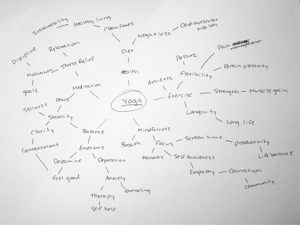
Conceptual-Exploratory: Mapping Abstract Ideas
A conceptual-exploratory visual helps to explore and understand abstract concepts without relying on specific data. A mind map, for example, explores the relationship between ideas. There is no “data” in a mind map, but the point is to see the relationship between ideas as they flow out of the mind. They encourage free association and reveal connections between ideas that may not be immediately apparent. This is helpful during brainstorming sessions and strategic planning sessions.
Data-Driven-Declarative: Presenting Data with a Clear Message
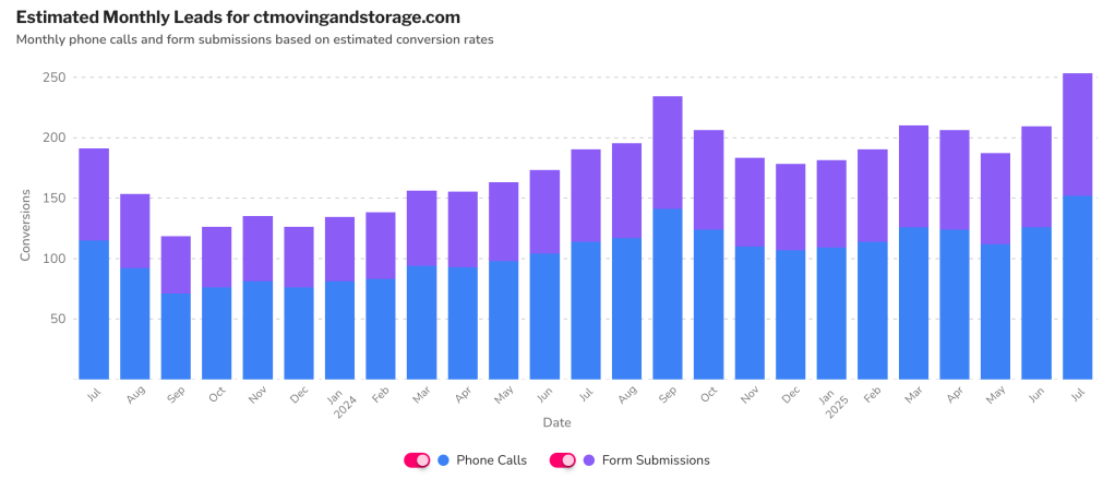
Data-driven-declarative visuals show data that is meant to support a specific finding or conclusion. Bar charts are a great example since they show upward or downward trends. The bar chart below shows the estimated monthly leads for a moving company located in Connecticut. It’s clear to see that the number of leads has overall increased in one year. These types of visuals are the best to use in reports, presentations, and articles where the data is being used to support a specific conclusion.
Data-Drive-Exploratory: Discovering Insights Through Data
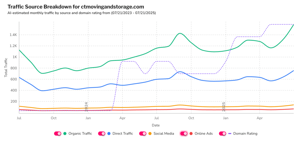
Data-driven-exploratory visuals explore data sets to find patterns, trends, or anomalies. This line graph for the same moving company in Connecticut is comparing different sets of (organic traffic, direct traffic, social media, online ads, and domain rating) over time. We can see the relationship between the growth of traffic and the overall domain rating. Visuals like this are best used in data analysis and research where understanding relationships in the data is critical.
Insights from David McCandless: The Beauty of Data Visualization
In his TED Talk, David McCandless reminds us that data visualization can reveal patterns and insights that can be missed when viewing raw data. He says, “By visualizing information, we turn it into a landscape that you can explore with your eyes, a sort of information map”. McCandless’ work blends data driven and conceptual elements to create visuals that are both informative and aesthetically pleasing. His approach shows that effective data visualization isn’t just about clarity, but also about engaging the viewer through both emotional and intellectual means.
Choosing the Right Visualization
By understanding the four different types of information visuals will help you when selecting the right one to communicate your message effectively. Use conceptual-declarative when you have complex ideas and want to explain them simply. A conceptual-exploratory visual will help to map out abstract concept. Use data-driven-declarative visuals when you are presenting data to support a specific conclusion and use a data-drive-exploratory visual when you want to analyze data and uncover new insights. By aligning your visualization with your communication goals, you will make your data more engaging and impactful.


Leave a comment