Have you ever landed on a website and aren’t sure what to do next? The problem isn’t you – it’s bad UX. In this UX audit, we’re going to break down a real business’s website to uncover usability issues, look for missed opportunities, and show how small changes can significantly improve performance. Having a website with good UX not only means users can navigate your website well, but it pays off with more leads for your business.
The Website We’re Auditing: CT Dry Basements
Home
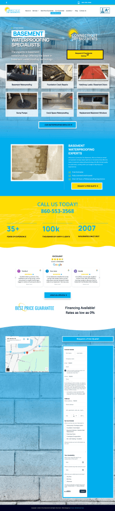
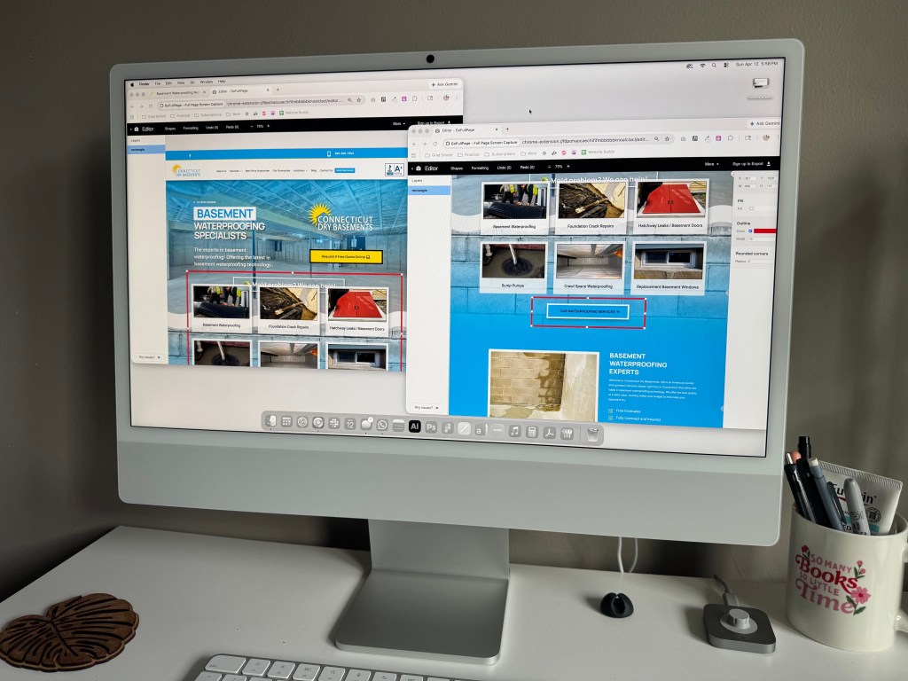
CT Dry Basements is a Connecticut based basement waterproofing company that offers services like sump pumps, crack repair, and crawl space solutions. Their site communicates their credibility and experience very well. However a closer look at the UX shows several usability issues that could be impacting their conversions.
Issue 1: Weak Visual Hierarchy
The homepage presents a lot of information at once. There’s text, service cards, multiple buttons, and inconsistent spacing. There’s no clear focal point. When a user lands on the site, they should immediately understand what the company does, why they’re different, and what to do next. In this case, everything is competing for the user’s attention at once.
How to Improve It:
- Introduce a clear hero hierarchy (headline, subheadline, CTA)
- Reduce the repetition of the services section
- Increase the amount of space between sections to help guide the eye
Issue 2: Redundant and Repetitive Content
The site repeats service categories multiple times, like Basement Waterproofing and Foundation Crack Repairs, in slightly different ways. While mentioning these keywords is important for SEO, this creates friction instead of clarity. From a UX perspective, repetition without a purpose overwhelms the user and waters down the messaging.
How to Improve It:
- Consolidate services into one clean section
- Use icons or cards with important keywords instead of repeating text blocks
- Ensure that text can be easily scanned
Issue 3: Lack of a Strong Call to Action (CTA)
The main CTA “Request a Free Quote” is on the page a lot, but they don’t stand out visually or strategically. They blend into the page instead of guiding the users’ behavior. This is a major issue especially for a service based business where conversions matter.
How to Improve It:
- Use a high contrast color for all CTA buttons
- Repeat CTAs at key scroll points
- Add urgency to the messaging (“Get a Free Inspection Today”)
Issue 4: Trust Signals Are Buried
The site includes multiple different types of trust indicators like years of experiences, customer reviews, licensing, and their BBB accreditation. However, they’re not prioritized. Users have to scroll down the page in order to see most of this.
How to Improve It:
- Move reviews and guarantees higher on the page
- Add badges, ratings, and quick stats at the top
- Better highlight guarantees and other value propositions
Issue 5: Mobile Experience Feels Outdated
While the site is responsive on the phone, the overall experience feels clunky and outdated. There’s a lot of images and heavy text blocks that slows down the mobile experience and makes users scroll for a long time. Most traffic to websites is from mobile devices, so not having an easy to use mobile experience is a critical issue.
How to Improve It:
- Reduce duplicate content
- Optimize image sizes and placement
- Stack content more intentionally
Key Takeaways from This UX Audit
This audit shows that CT Dry Basements biggest problems aren’t functionality, but rather they’re clarity. Even a legitimate, highly reviewed business can lose conversions due to poor structure and usability issues. A strong UX critique focuses on clear hierarchy, focused messaging, and guided user flow. CT Dry Basements has a strong foundation, but their website doesn’t fully support that. With a cleaner layout, stronger CTAs, and better prioritization of trust signals, the site can convert significantly better without changing the core message. That’s the power of a UX audit. We identify what’s already there and make it work harder.


Leave a comment