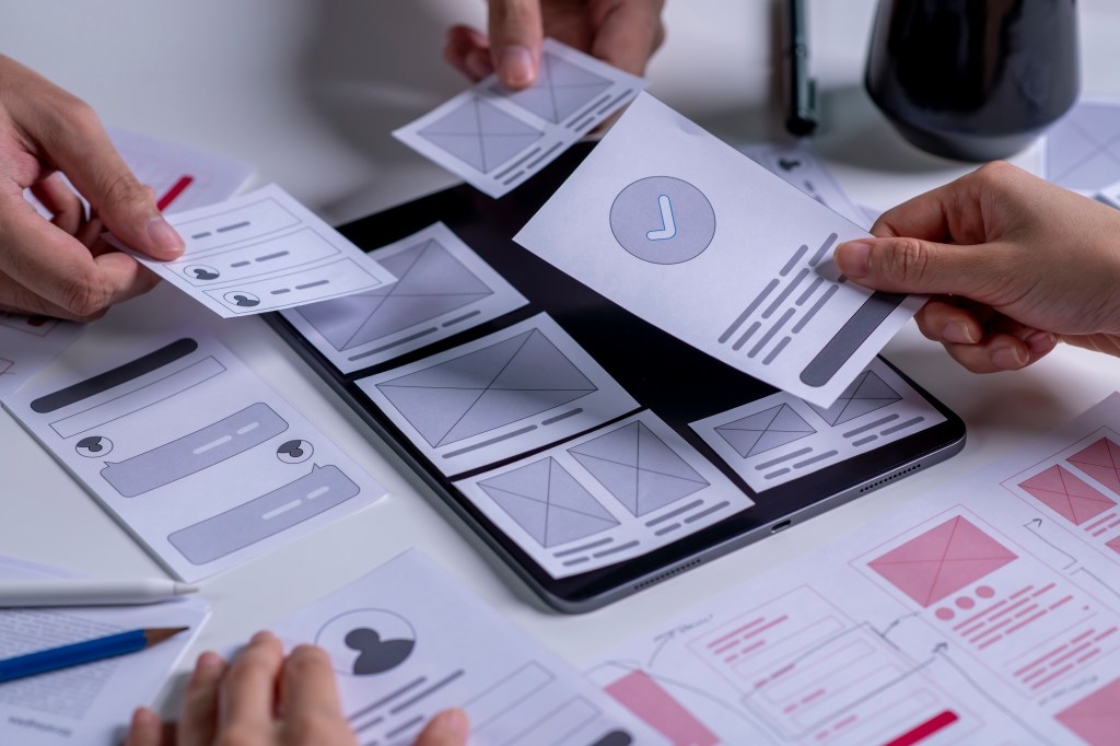
This week we dive into the world of paper prototyping – a fast and surprisingly effective method for visualizing user flows and interfaces without opening a design program. It takes all of the strategies that have been built so far – sitemaps, information architecture, and user flows – and begin to make them come alive. The MyPlymouth app helps connect residents and business owners to their local government’s services. The user experience needs to be simple and intuitive for the different types of people using the app.
The Basics of Paper Prototyping
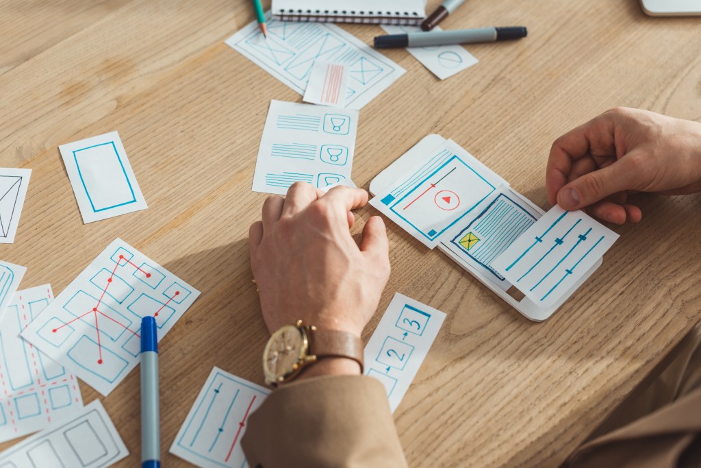
Paper prototyping is the process of hand sketching different screens that represent the digital product and its user pathways. Paper prototypes are considered to be low fidelity because they don’t function. The main purpose of a paper prototype is for design teams to mock the flow that a user will take to complete a task. It allows for rapid iterations and documentation at a low cost with very minimal effort. To make paper prototypes, you’ll need a few very basic office supplies including; paper, pens and pencils, markers or highlighters, and sticky notes.
UXPin.com summarizes paper prototyping into three easy steps:
- Prepare your materials: Gather the necessary supplies to complete your sketches.
- Sketch interfaces: Draw basic screens and other components. After all interfaces are complete, lay them out in order sequence.
- Simulate interaction: Have someone interact with your sequence as if they were using the real product. Manually switch screens and components as tasks are completed.
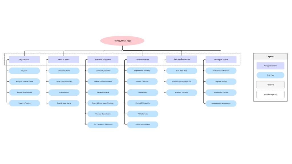
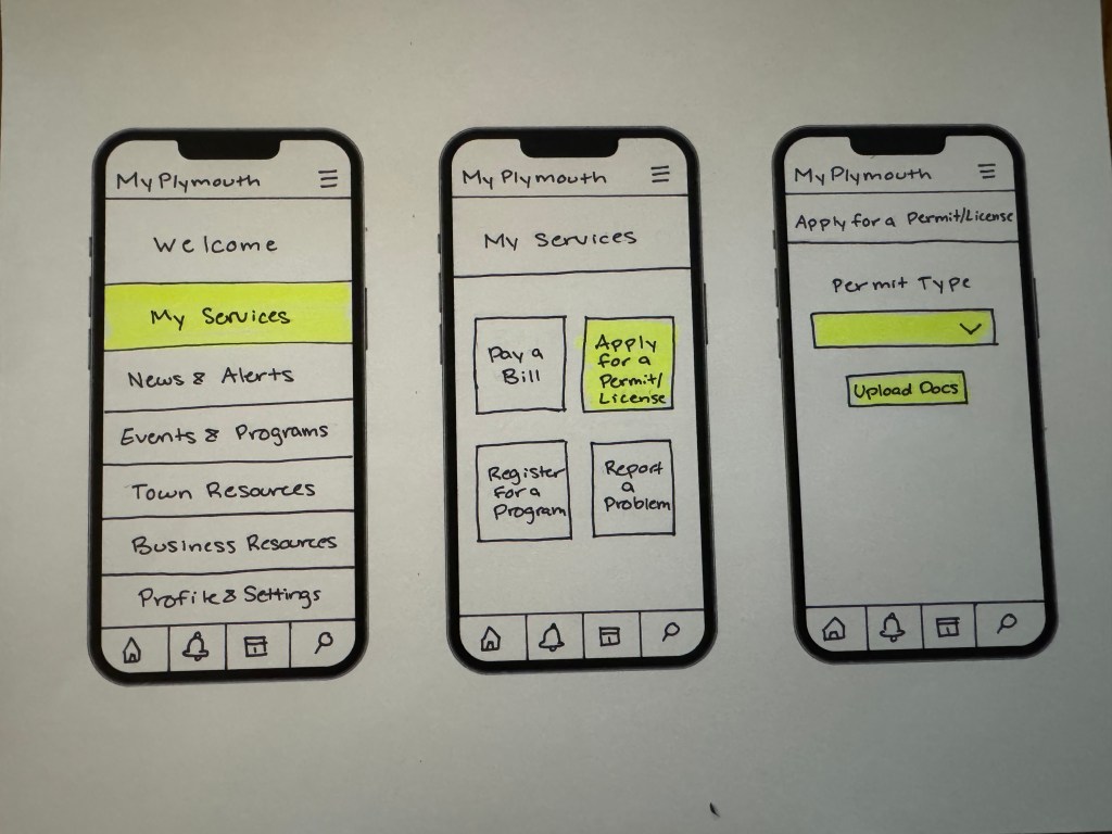
Revised Sitemap & Navigation
The sitemap for the MyPlymouth app went through some minor tweaks after careful consideration of what users would need to be able to do. The major categories on the home screen now direct users to:
- My Services
- Event & Programs
- News & Alerts
- Town Resources
- Business Resources
- Profile & Settings
These core pillars were picked based on user priorities for quick access and repeat use. The following prototypes are navigable through clear interaction areas highlighted in yellow to show what’s clickable to complete the task.
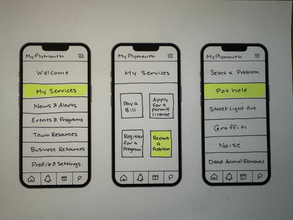
Task 1: Report a Town Issue
This is one of the most important uses for the app. Residents will want to quickly be able to report a problem they see around town like a traffic light outage, pothole, or graffiti.
This flow includes:
- Landing on the home screen
- Navigating to “My Services”
- Selecting “Report a Problem” from a list
- Choosing an issue from a scrollable menu
- Uploading a photo of the issue
- Noting the location
- Adding a description of the problem
- Submitting the form
- Receiving a confirmation
Each interaction has been broken down into its own screen to replicate how a real app would function. This allows us to see how different components like dropdown lists, location pins, and image upload buttons.

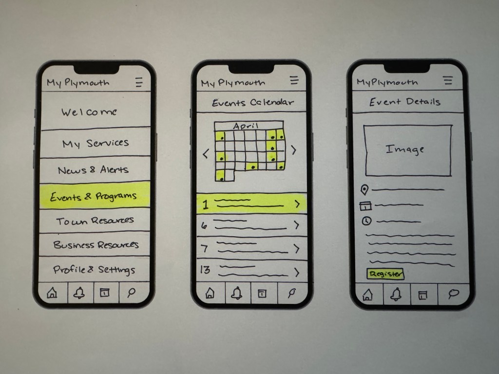
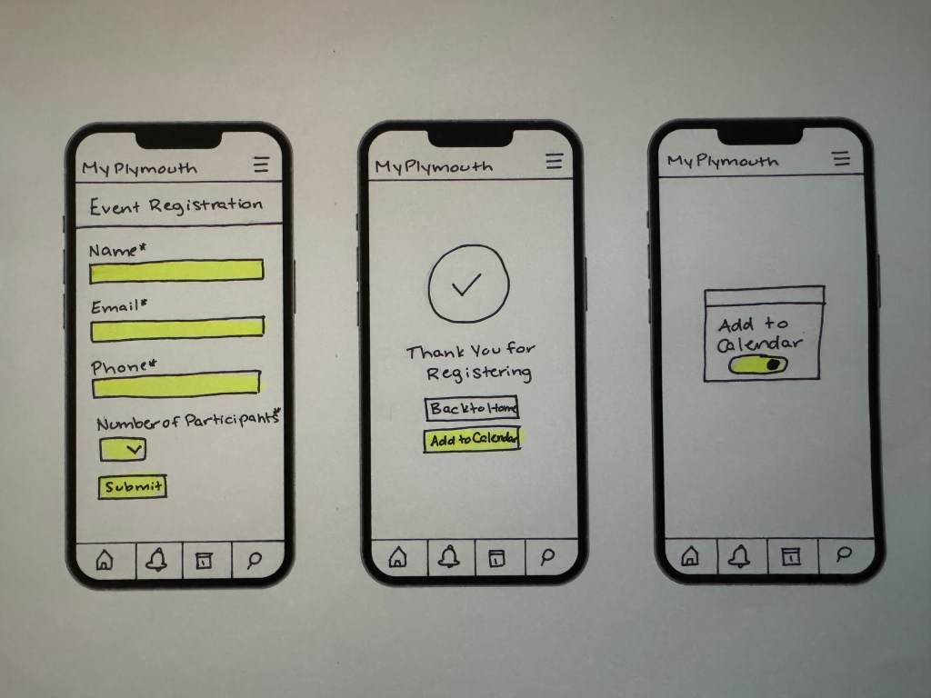
Task 2: Register for a Local Program
Towns often have classes and events throughout the month, but aren’t often widely known about. This flow helps residents see what’s happening in town and register right from their phone.
- Landing on the home screen
- Selecting “Events & Programs”
- Viewing a calendar or list of events
- Selecting an event
- Viewing event details
- Filling out a registration form
- Receiving a confirmation with the option to add the event to their calendar
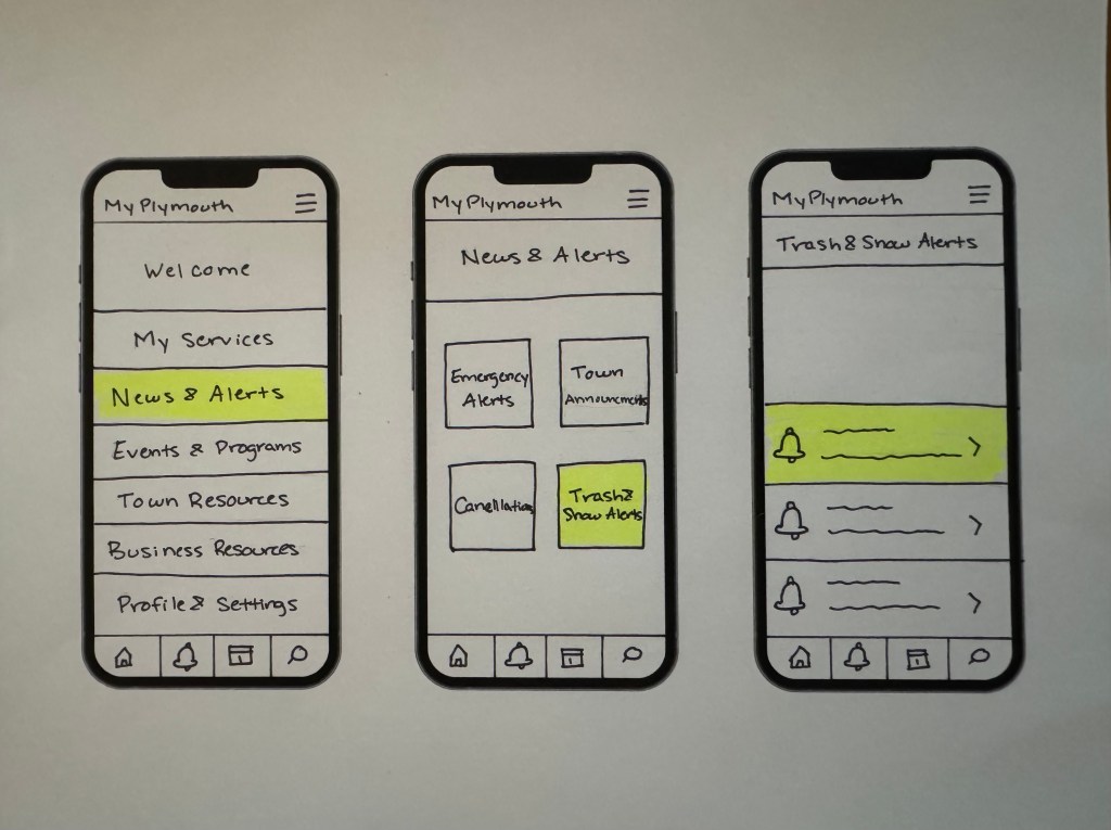
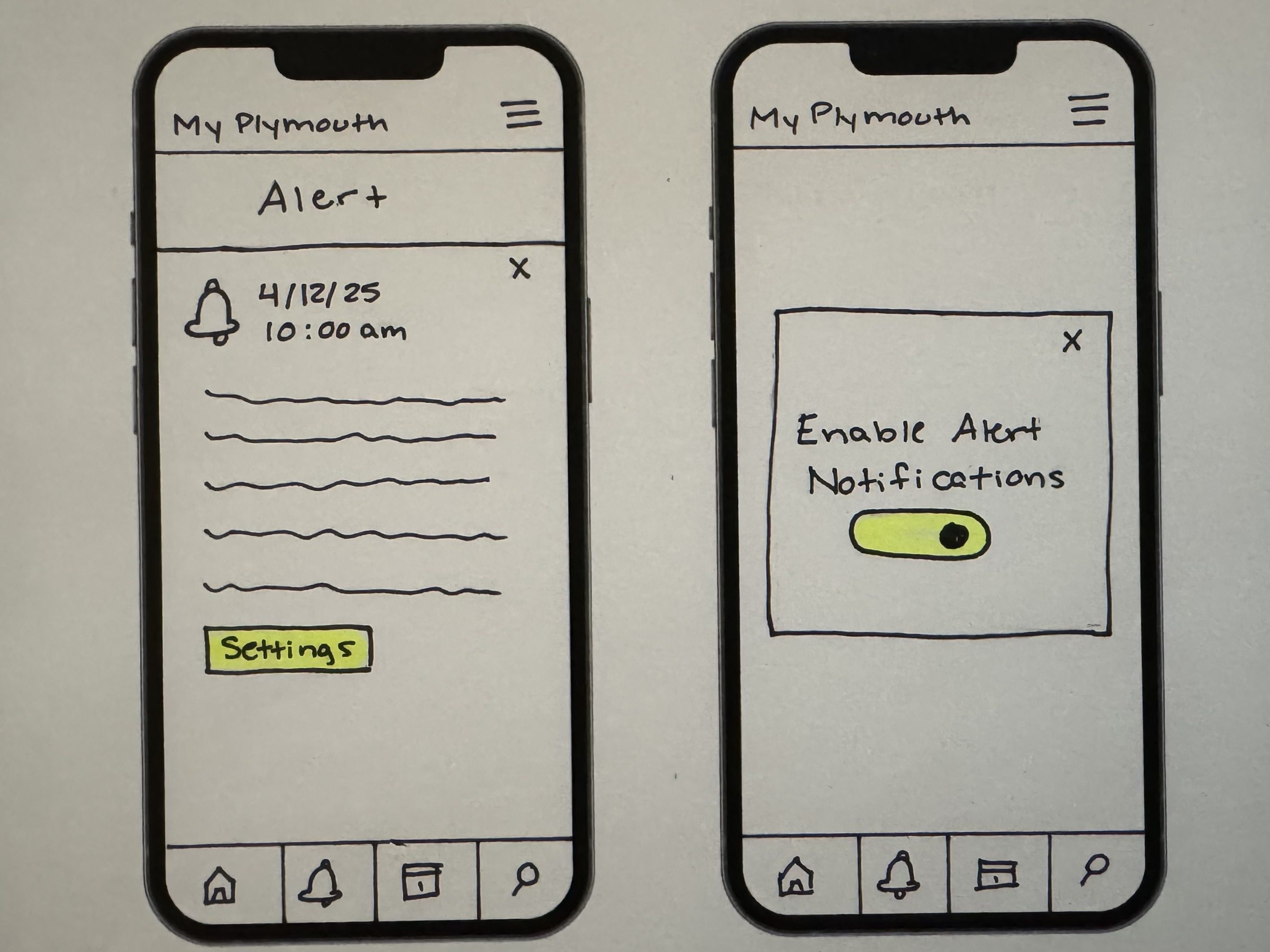
Task 3: Check Trash and Snow Alerts
This task relies heavily on being clear and immediate. Residents will need to go through as little steps as possible to check if their trash pickup is delayed or if there are any weather related emergencies.
This flow includes:
- Landing on the home screen
- Navigating to “News & Alerts”
- Selecting “Trash & Snow Alerts”
- Viewing a list of active alerts
- Clicking into a detailed alert page
- Accessing a popup to toggle notifications on/off
Task 4: Apply for a Permit or License
This task is a little more complex because it involves conditional navigation based on the permit or license application selected.
- Landing on the home screen
- Going to “My Services”
- Selecting “Apply for a Permit/License”
- Choosing the permit type
- Filling out the application
- Uploading documents
- Submitting the form
- Confirmation screen
- Viewing saved applications and their status
By breaking this action into multiple screen, it reflects a real life form which can be tedious but is necessary. The forms are kept minimal by using the least amount of fields possible.

Final Thoughts
This phase of the design process is about translating initial concepts into tangible interactions. Using only paper and pens, you are free to experiment without the pressure of making things perfect. Layout ideas, button placement, and overall logic can be tested before investing time into high-fidelity mockups. By aligning your design with real user tasks, you are aligning yourself with your user instead of your aesthetic preferences.


Leave a comment