
Understanding the why behind a user’s click is what separated good design from high performing design. At the core of every interaction is human decision making and that’s where UX psychology comes in. When you align your design with real behaviors from real users, you are able to remove friction, build trust, and guide users towards actions without it feeling forced. Below are five essential UX principles that are grounded in psychology that directly influence clicks and overall engagement.
1. Hick’s Law: Too Many Choices Kill Action
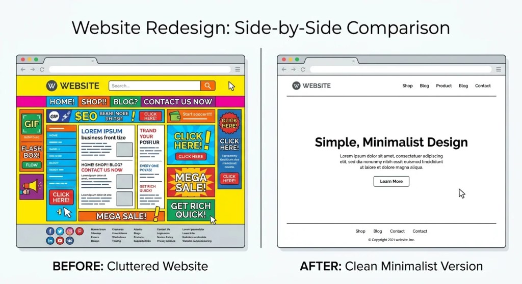
Samantha Lau, from The Design Lab, states that Hick’s Law is the phenomenon when the more options a user has, the longer it will take them to make a decision. In UX, this length of time often leads to abandonment. When a user lands on a page that has too many buttons, links, or calls to action they will hesitate and that hesitation is the enemy of clicks.
How to Apply It:
- Limit primary CTAs to one clear action per section
- Reveal information as needed to not overwhelm the user
- Keep navigation menus simple and straightforward
Streamlining interfaces helps to reduce cognitive load and make a user’s decision feel effortless.
2. Visual Hierarchy: Guide the Eye, Guide the Click
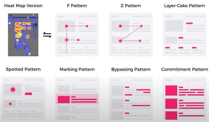
Users aren’t fully reading websites. Instead they scan them to find the information they’re looking for. This means that good visual hierarchy determines what they see first, second, and last. By using size, contrast, spacing, and placement you direct the user’s attention exactly where you want it.
How to Apply It:
- Make your primary CTA the most visually dominant element
- Use appropriate whitespace to separate sections
- Follow natural reading patterns
When everything looks important then nothing actually is and your users can’t find the information they need.
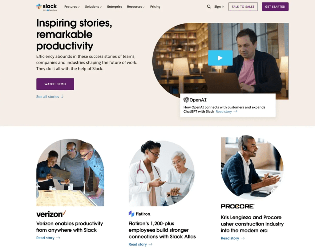
3. Social Proof: People Trust People
Jen Cardello, from Nielsen Norman Group, explains that social proof is another psychological phenomenon where people reference another person’s behaviors to guide their own. This is especially prominent when a user is facing an uncertain situation.
How to Apply It:
- Include testimonials near conversion points
- Show star ratings, reviews, or client logos
- Use real photos instead of stock imagery when possible
The key is to be authentic. Generic testimonials won’t make an impact, but specific and believable ones will.
4. Fitt’s Law: Making Clicking Effortless
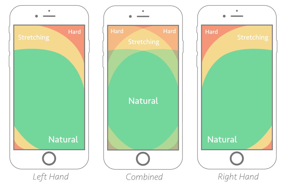
Fitt’s Law is the idea that the time it takes to interact with something depends on it’s size and distance. For UX that means, the bigger and closer a button is, the easier it is to click. This is one of the most practical UX principles that can be applied immediately.
How to Apply It:
- Use large, easy to click buttons (especially on mobile)
- Keep important actions within thumb reach
- Avoid placing CTAs in hard to reach areas
If your website is set up so that users have to work to click, then many of them just won’t.
5. Cognitive Biases: Design for How People Actually Think
Humans don’t make perfectly rational decisions. We rely heavily on mental shortcuts called cognitive biases. To make UX design smart, you should work with these biases and not against them. Some key cognitive biases are:
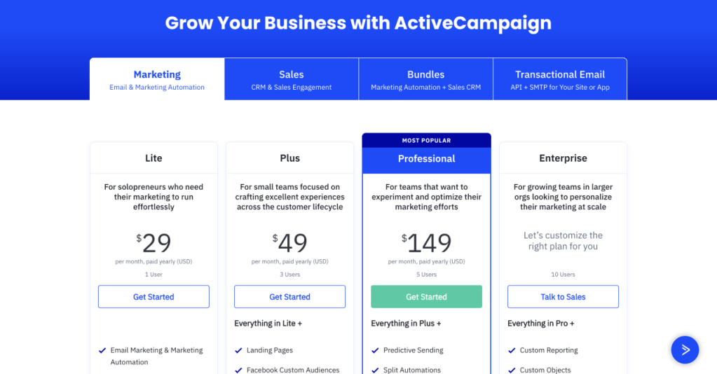
- Anchoring bias: Users rely heavily on the first piece of information they see (i.e. showing a higher original price next to a discounted one)
- Loss aversion: People are more motivated to avoid loss than gain something (i.e. “Don’t Miss Out” sales)
- Scarcity effect: Limited availability increases perceived value
How to Apply It:
- Highlight limited time offers
- Frame messaging around what users might lose
- Strategically present pricing and comparisons
When used ethically, these principles help users make faster and more confident decisions.
Final Thoughts
Great UX isn’t about guessing. Instead, it’s about understanding. When you design with UX psychology in mind, you stop relying only on trends and start aligning with real user behavior. These principles are practical tools that you can apply to every page, layout, and interaction you design. Start small and pick one that you can refine your design around. Then continue to test, iterate, and learn. Users aren’t randomly clicking. They click when something feels clear and easy.
Which of these UX principles do you use the most?


Leave a comment